Introduction:
-
Hook the reader with a problem: “Struggling to make your print materials stand out?”
-
Mention what the blog will cover.
-
Include the primary keyword early.
Creating eye-catching print layouts is essential for grabbing attention, whether it’s a magazine, flyer, or brochure. In this guide, we’ll walk you through the best strategies to design layouts that not only look great but also communicate your message effectively.
Understand the Basics of Print Layouts
-
What is a Print Layout?
-
Importance of Visual Hierarchy in Print
Choose the Right Typography
-
Font pairing tips
-
Readability considerations
Use Color Strategically
-
Color psychology in print
-
Contrast and balance
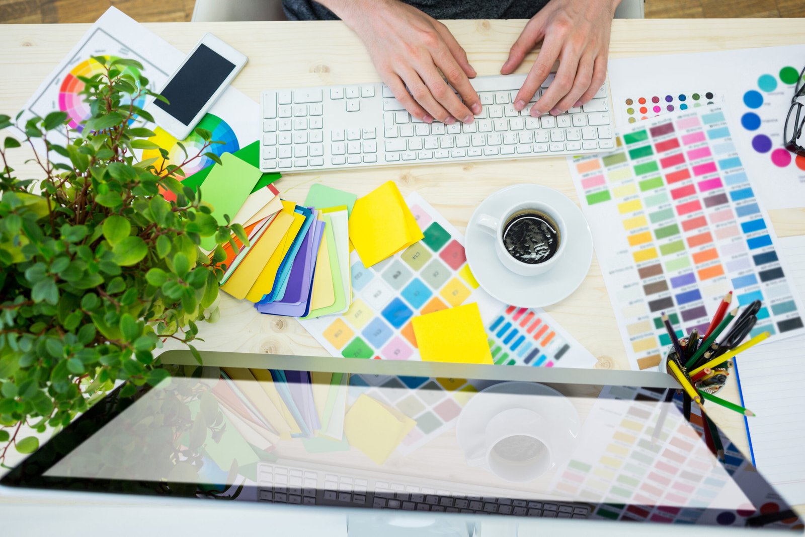
Focus on Images and Graphics
-
High-quality images for print
-
Balancing text and visuals
Create a Balanced Layout
-
Grid systems and alignment
-
White space for readability
Test and Iterate Your Design
-
Print proofs
-
Getting feedback
Bonus Tips for Eye-Catching Layouts
-
Use call-to-action strategically
-
Experiment with textures or patterns
Conclusion + CTA
-
Summarize key points: typography, color, images, layout, testing.
-
Encourage readers to try their own designs.
-
CTA example: “Ready to design your eye-catching print layout? Start experimenting with grids, colors, and fonts today!”
![]()