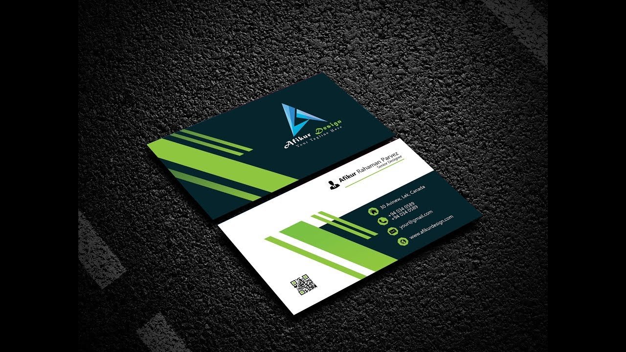
A business card is often the first physical impression of your brand. Even in the digital age, a well-designed business card plays a powerful role in building trust and professionalism. A poorly designed card, on the other hand, can make your brand look unprofessional.
In this blog, we’ll share essential business card design tips to help you create a clean, professional, and memorable business card.
1. Keep the Design Simple and Clean
Simplicity is the key to professionalism. Overcrowded business cards look messy and are hard to read.
Best practices:
-
Avoid too much text
-
Use white space effectively
-
Focus only on essential information
A clean layout makes your card easy to read and visually appealing.
2. Use Readable and Professional Fonts
Typography greatly affects how professional your business card looks.
Font tips:
-
Use 1–2 fonts only
-
Avoid decorative or script fonts
-
Ensure font size is readable (minimum 8–9 pt)
3. Choose the Right Color Scheme
Colors should reflect your brand identity and create a professional impression.
Color tips:
-
Stick to brand colors
-
Avoid using too many colors
-
Maintain good contrast between text and background
Neutral and balanced color combinations often look more professional.
4. Include Only Essential Information
A professional business card should contain only the most important details.
Essential elements:
-
Name
-
Job title
-
Company name/logo
-
Phone number
-
Email address
-
Website or social media (if relevant)
Avoid adding unnecessary details that clutter the card.
5. Use High-Quality Materials and Printing
The quality of paper and printing matters just as much as the design.
Professional printing tips:
-
Use thick cardstock
-
Choose matte or soft-touch finish
-
Consider special finishes like embossing or foil (if suitable)
High-quality printing enhances the overall feel of your card.
6. Pay Attention to Alignment and Spacing
Proper alignment gives your card a polished and organized look.
Layout tips:
-
Use grid alignment
-
Maintain consistent spacing
-
Avoid placing text too close to edges
Good spacing improves readability and balance.
7. Don’t Forget Print-Ready Settings
Many business card designs fail because they’re not prepared for print.
Print checklist:
-
Use CMYK color mode
-
Set 300 DPI resolution
-
Add bleed and safe margins
-
Export as print-ready PDF
These settings ensure your card prints perfectly.
8. Add a Unique but Subtle Touch
A small creative detail can make your card memorable without losing professionalism.
Ideas:
-
Minimal icons
-
Rounded corners
-
Spot UV on logo
-
Vertical layout
Keep creativity subtle and aligned with your brand.
Conclusion
A professional business card is simple, clear, and well-crafted. By following these business card design tips, you can create a card that represents your brand with confidence and leaves a strong first impression.
![]()
